Creative Workbench
Reducing friction in the creative process
Workflows and software for marketing content creation are often overly complex and inefficient, and thus expensive, time wasting, and resource intensive.
Client: Capital Group
Roles: UX Strategy, Art Direction, UX Design, Visual Design, Branding
Challenge
The marketing department's process to get a piece of content out the door was no less than 13 steps touching several pieces of different software. Multiply this across several sites, several times a week, meant we often had bottlenecks. Not to mention it also had to be industry compliant.
For this project I was the Design Lead and UX/UI Designer, working closely with another UX Designer to reduce the overall complexity while improving usability.
Approach
We focused the process around our main users – content creators such as writers and designers, and empowered them to do the creative work they're best at, unencumbered by process and software.
Because users were our own associates, we had the great opportunity to gather a wealth of user inputs, including user interviews, observations, and usability testing.
User flows
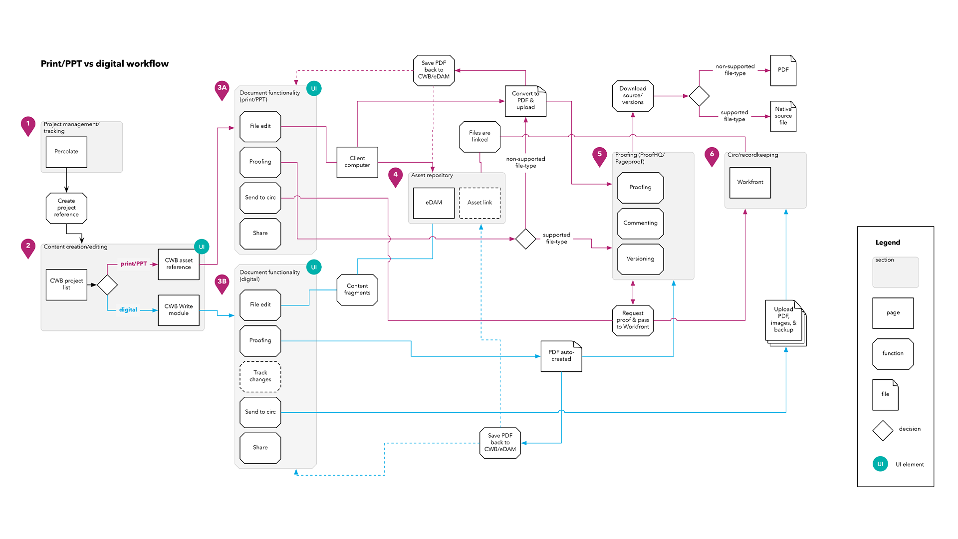
Because of my deep understanding of the current process and software involved, I worked through the user flows and architected a more efficient process that included new capabilities and features.
Wireframes
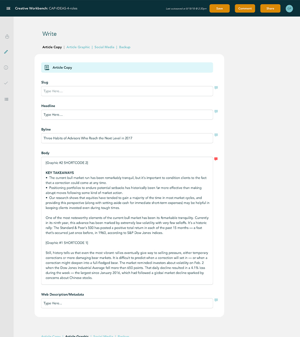
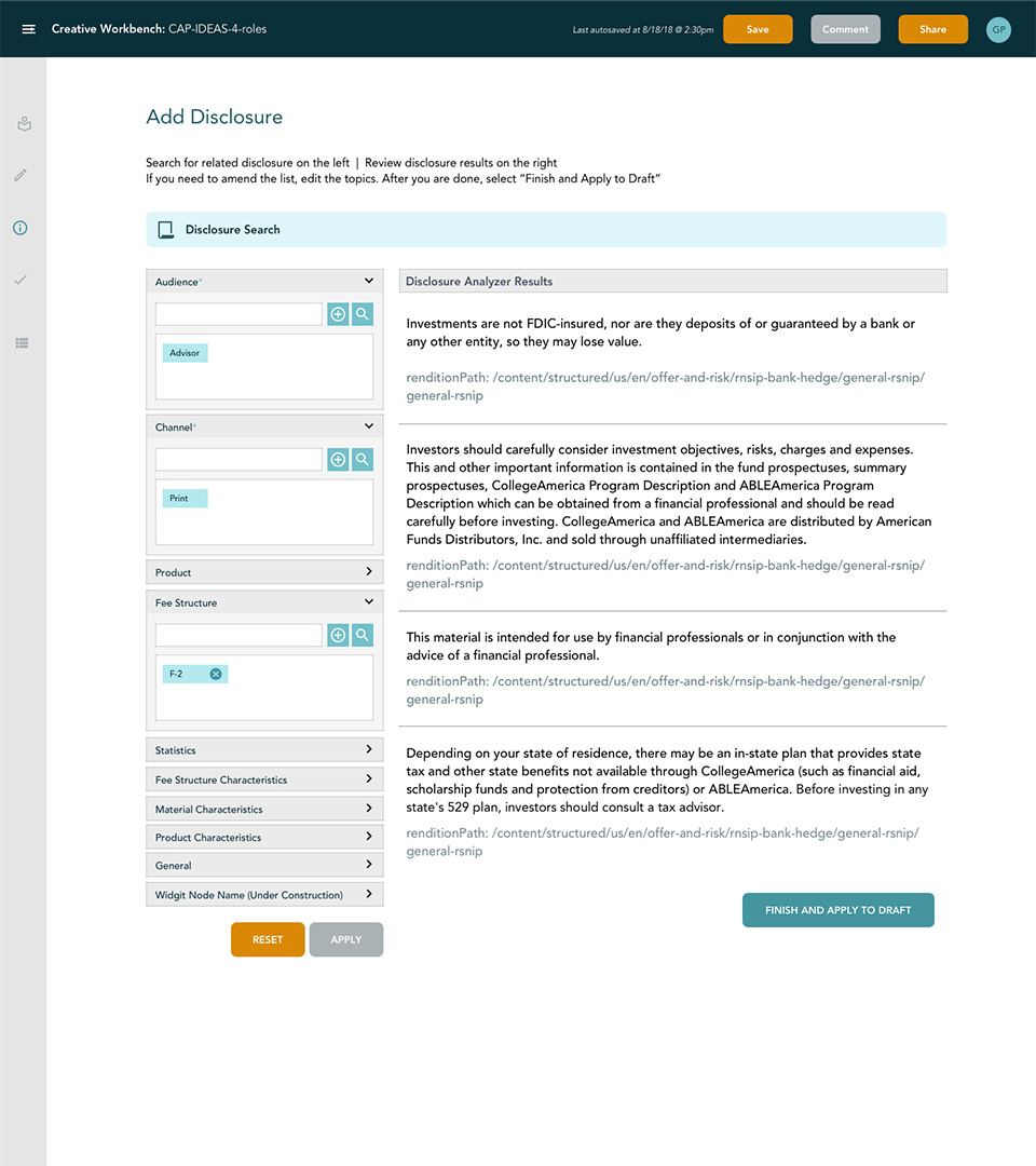
Several iterations of wireframes were created by different UX Designers until we got to a good baseline of design patterns. I then used these to start building out the UI and design system.
Ecosystem
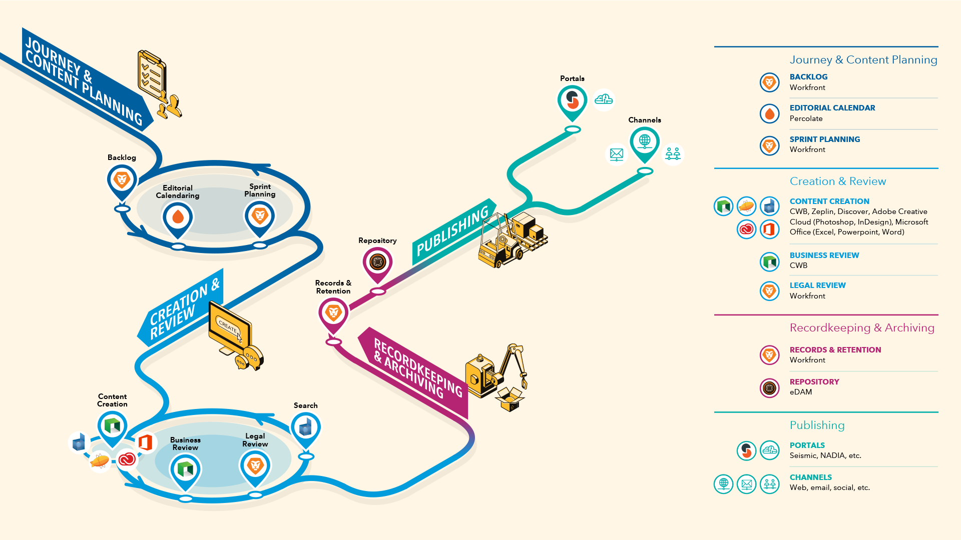
We felt that an important part of getting buy in and adoption was to ensure that users had a good understanding of the whole ecosystem they were working in. I created this graphic to give a more engaging and simplified glimpse into the process.
Logos
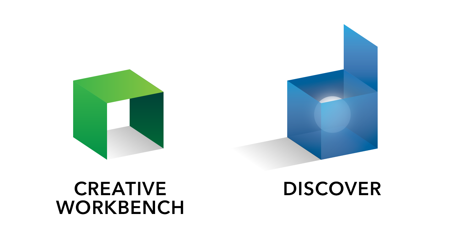
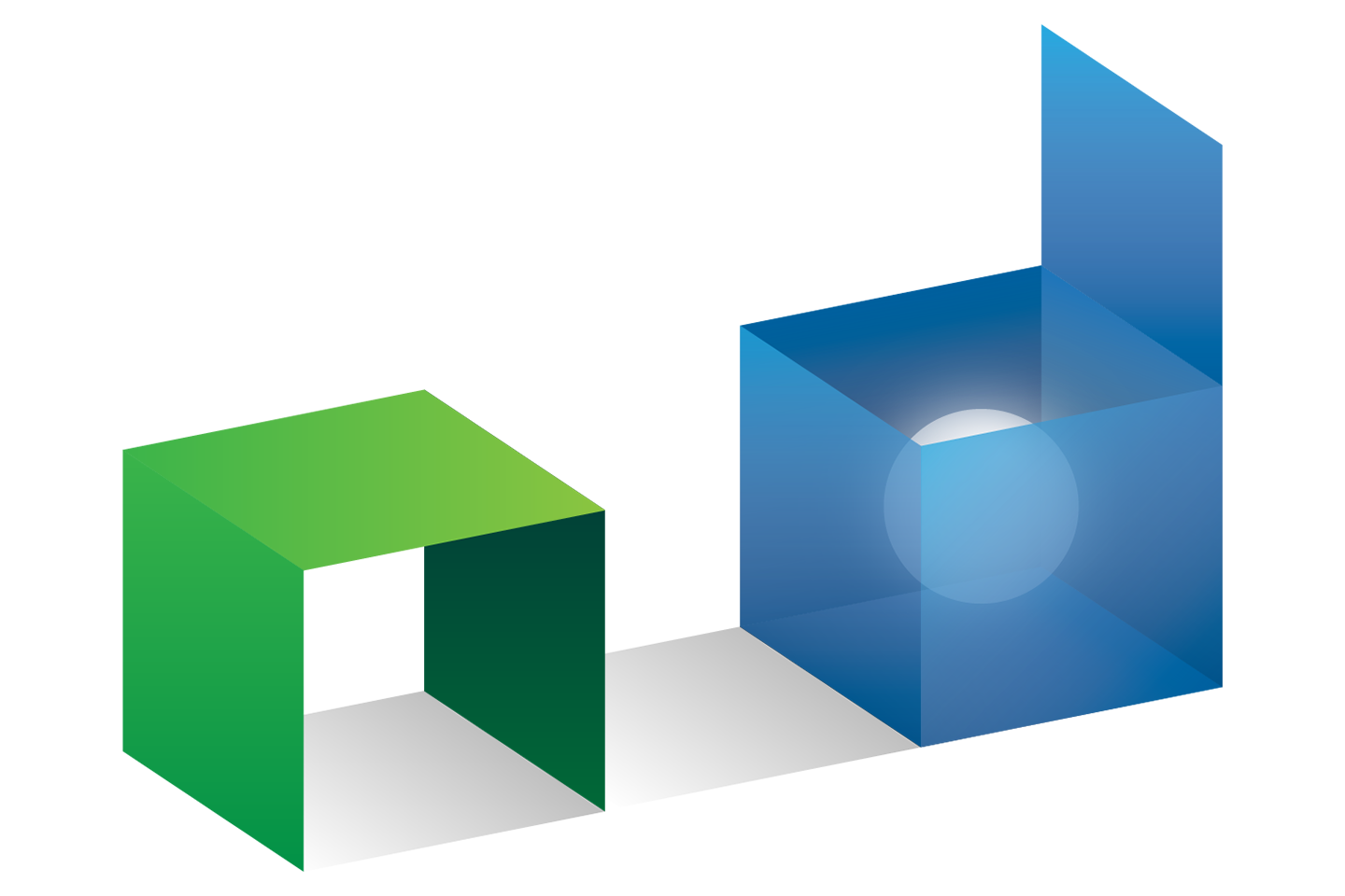
To help legitimize the in-house built software, I was tasked to create the branding for two of the main pieces of the software. I wanted to ensure that they felt within the same family and so I used a cube motif. The Creative Workbench logo incoporates a table that is a "C" turned on its side, while the Discover logo is an open box invoking the shape of a lower case "d", with something to discover inside. The concept also alludes to Discover's functionality as a search engine.
Initial Designs
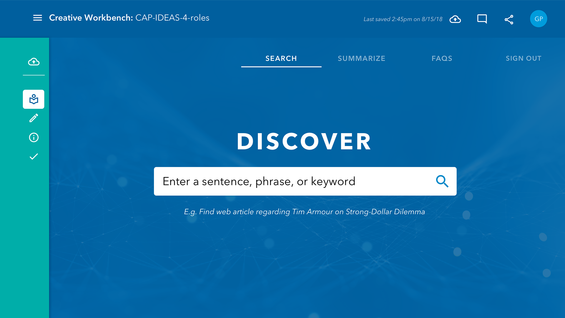
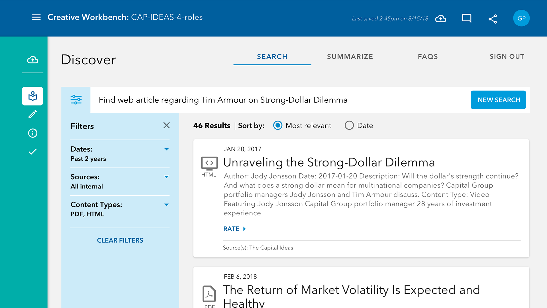
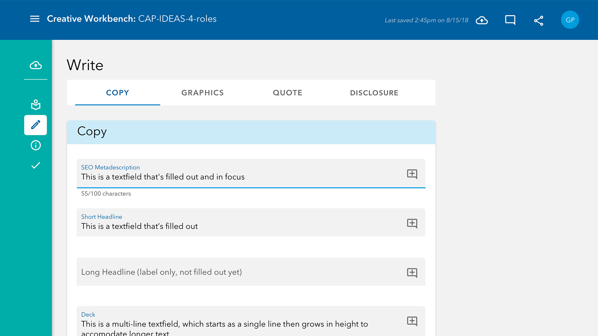
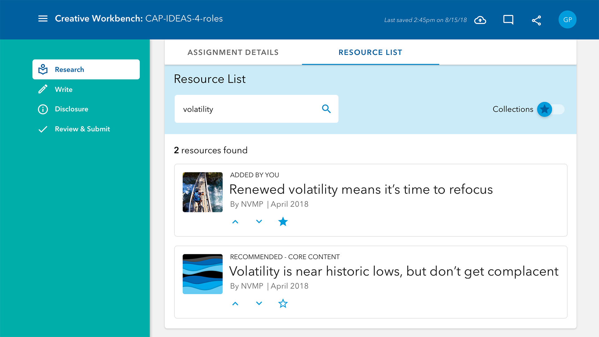
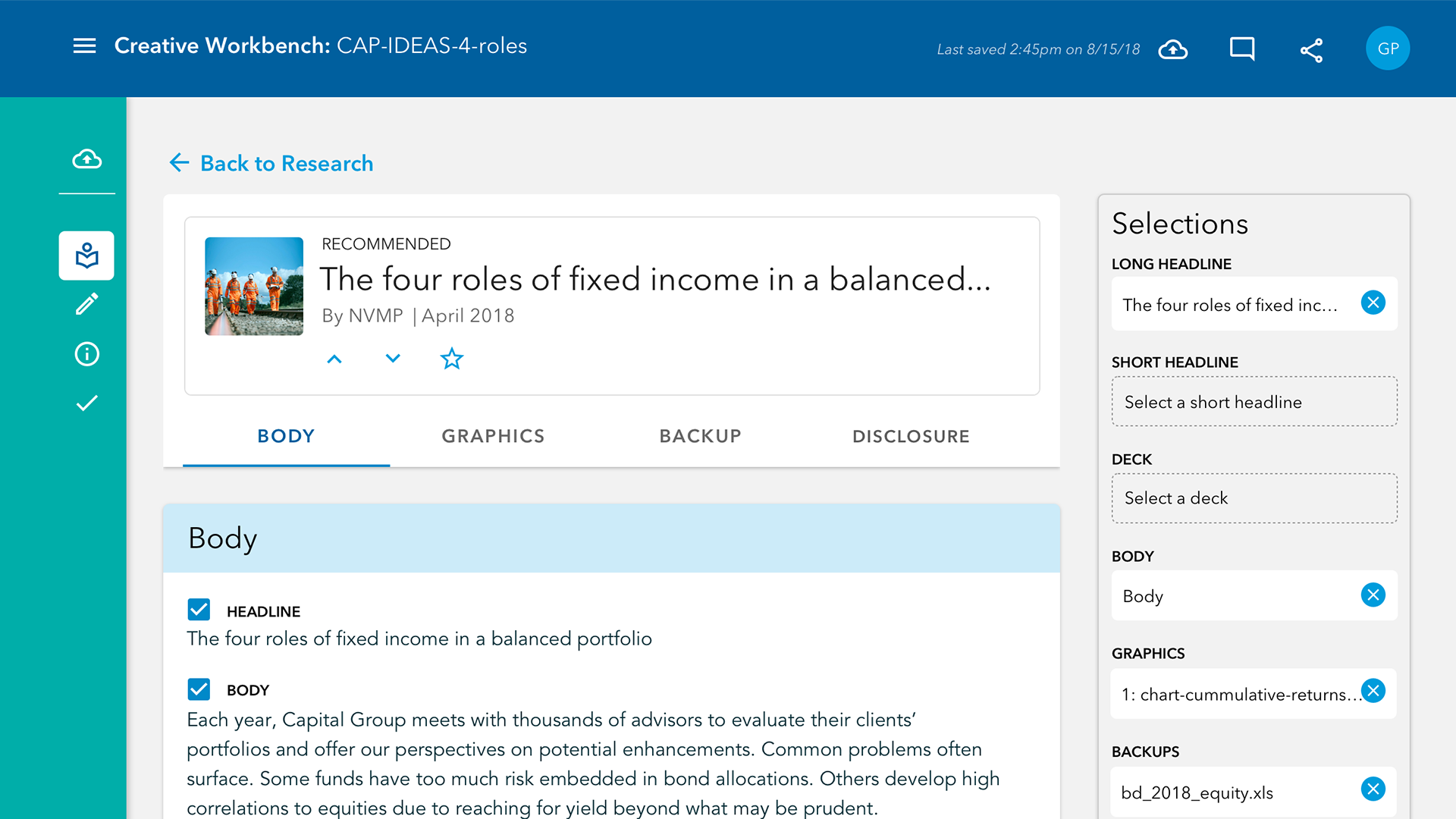
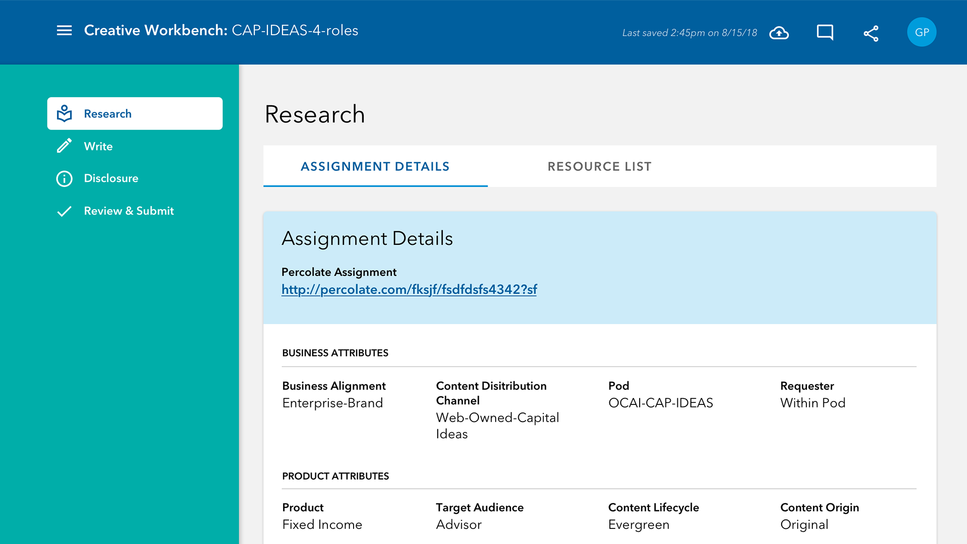
I created an initial pass of designs to give a sense of the design language, as well as provide some materials to be able to user test on.
Final Designs
I tweaked the designs to bring in more color to liven up the interface and make it more of a joy to use, as users would have to sit with this several hours a day.
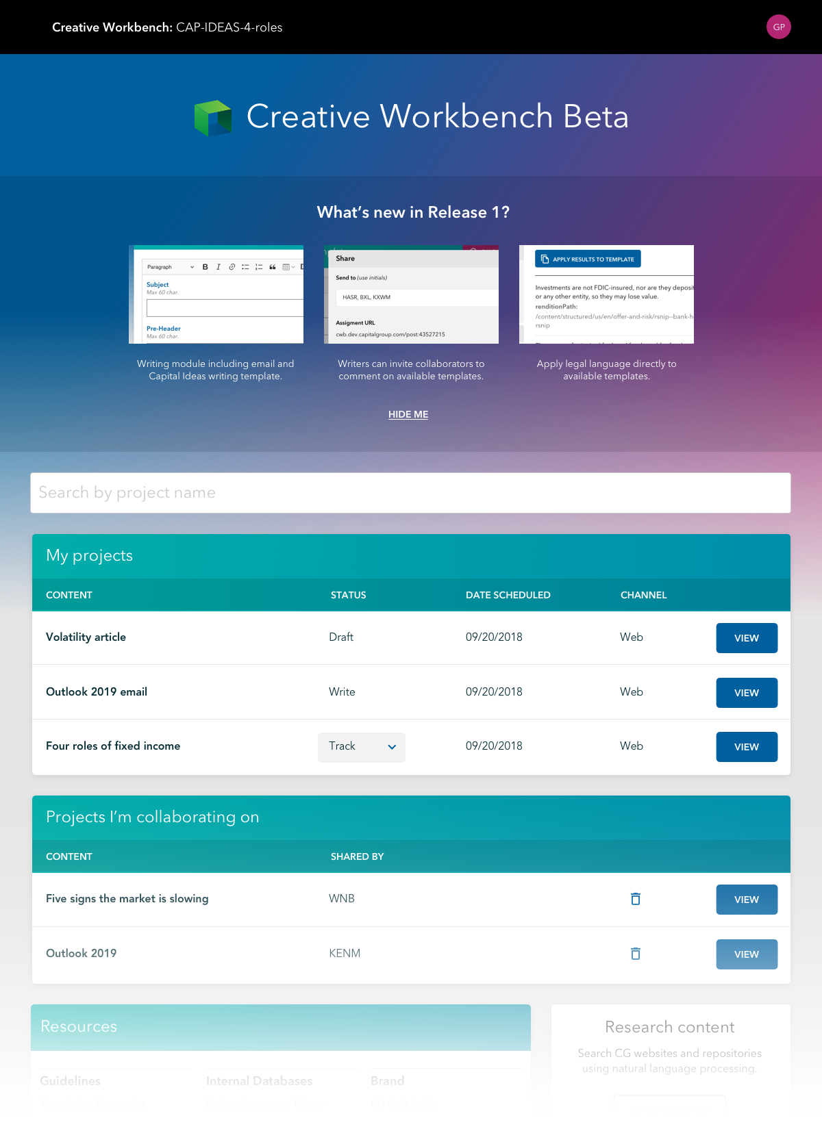
Project List
The landing screen of the Creative Workbench had a project list which consolidated all the work that the writer either owned or was collaborating on.
From this screen they could manage projects and shepard them across different statuses.
Writing Tool
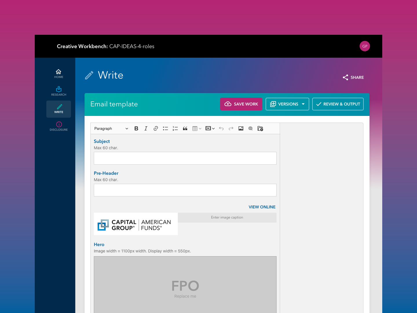
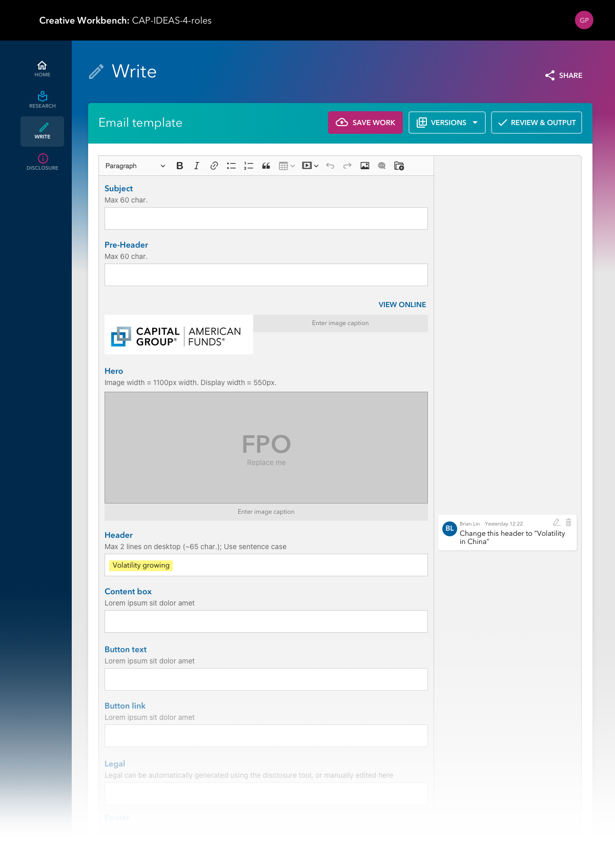
This writing tool was based off an open source project but customized for our needs. It used fields in order to provide semantic structure to the writing, and included formatting and commenting for feedback. They could also kick off a proof from this screen to start the review process.
Prior to this, writers would write in Word documents, saved to their local machines.
Discover Cognitive Search
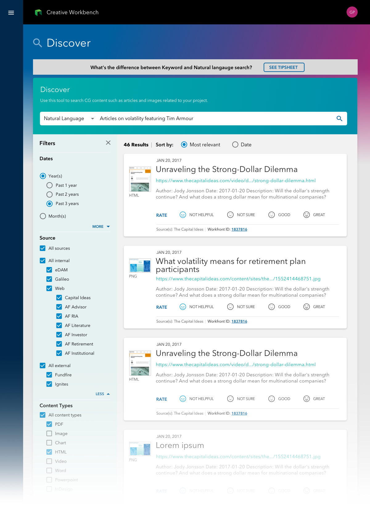
Discover use two different methods of search: keyword and NLP (Natural Language Processing), which is an AI, machine learning based method of search that allowed users to type in queries as normal, natural language.
Planned within the roadmap is to feed the semantically structured content from the writing tool in order to better process search results.
Disclosure
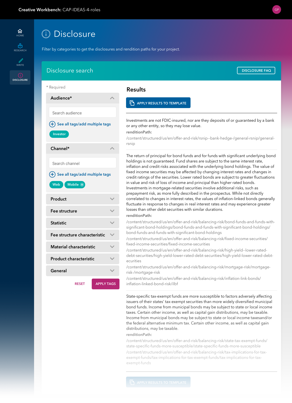
Disclosure was often the number one painpoint for writers, who were ofen relied on to provide the first pass on legal disclosure without necessarily being subject matter experts.
This tool automagically generates disclosure based on tags. Future enhancements would include machine learning capabilities with the ability to read the content and generate disclosure from that.
Outcomes
This project was one of the most ambitious undertakings to build an internal tool from scratch. While the project itself was shelved due to unforseen budget constraints, it provided valuable insights and lessons which informed our later adoption of third-party tools.
