Advisor App
A streamlined experience for advisors in the field
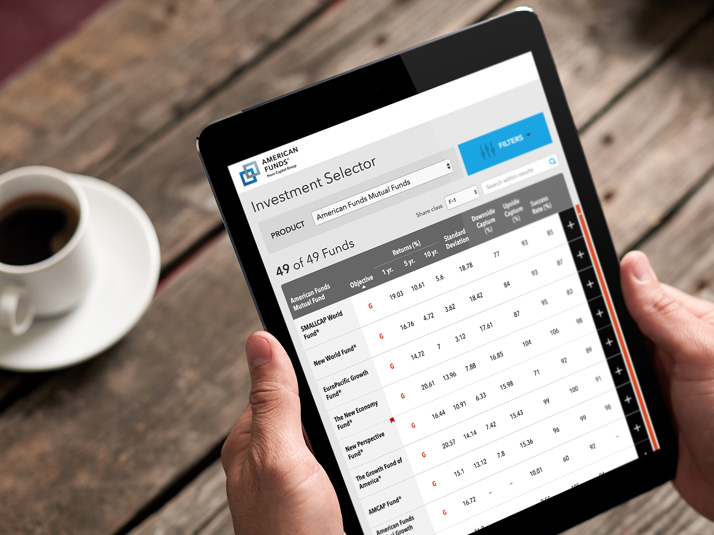
Capital Group had undergone a recent rebranding that included a responsive redesign of its websites. While the site was now mobile friendly, the question remained whether a mobile optimized native application made sense for their audience of financial advisors, which could enhance their work in the field, equipped with their tablets.
I led a small team to do some discovery/research as well as explore some concepts. Given our aggressive timeline I wanted to make sure that my team was as agile and lean as possible. I adopted a Lean UX approach, which gave us the advantage of a bias towards outcomes rather than documentation, and the ability to quickly adapt to shifting requirements.
Client: Capital Group
Roles: Creative Direction, UX Strategy, Prototyping
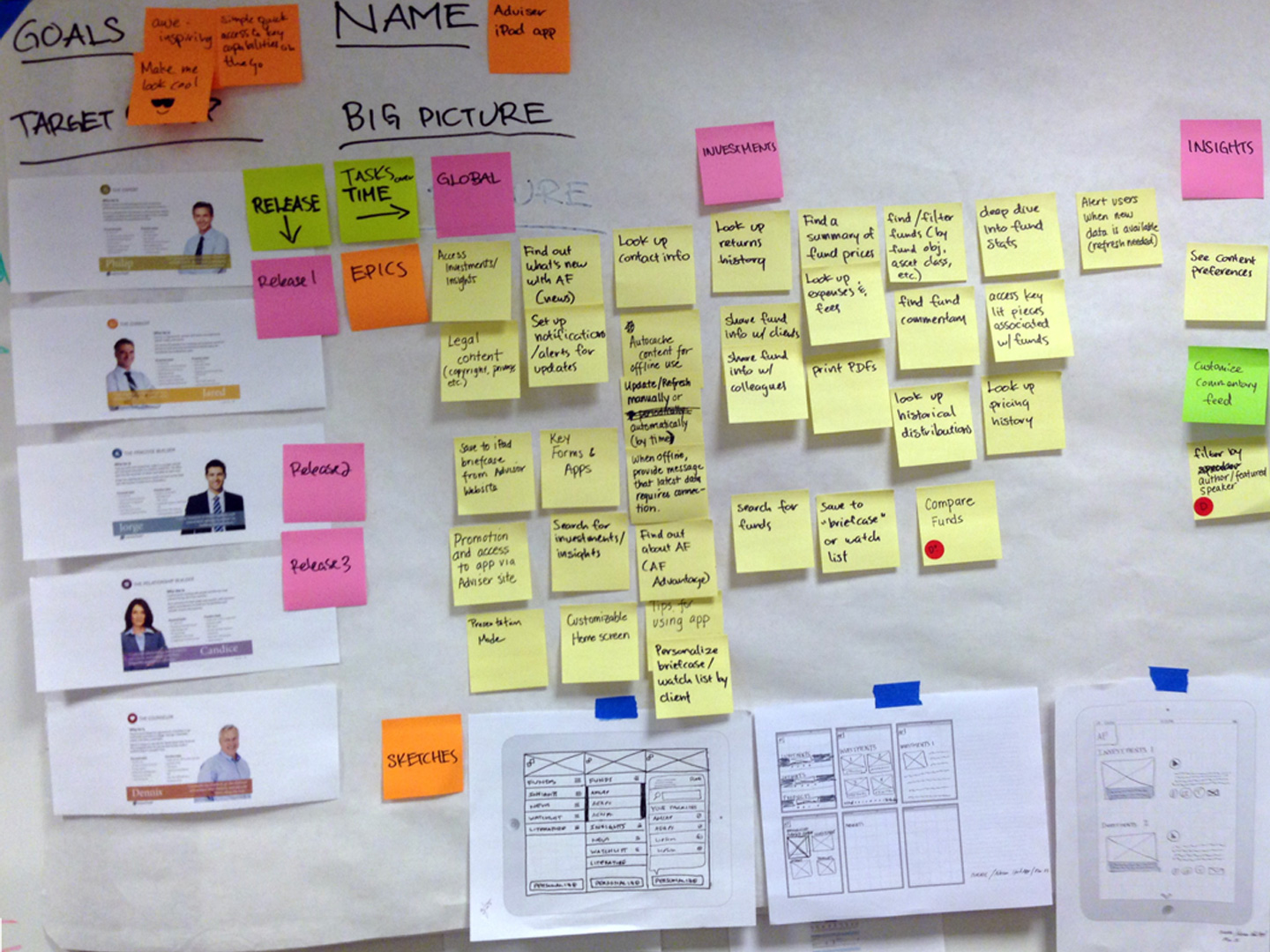
Product Canvas
I introduced my team to the product canvas, a lean approach to product management. This would capture our product goals, personas, stories, and artifacts, to ensure they were always visible and top of mind. I ran UX rituals straight from the canvas, refreshing stories and sketches during each new sprint.
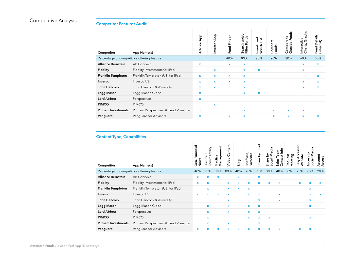
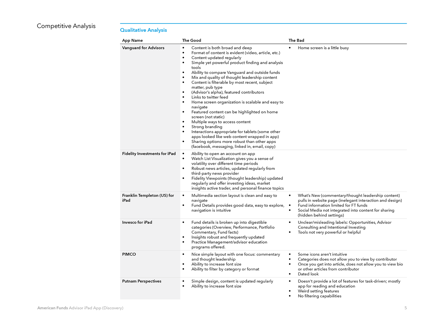
Competitive Analysis
Working with the content strategist, we did a competive analysis of the app offerings of other financial institutions, in order to identify best practices, gaps, and opportunities. This included an audit of features and capabilities, as well as qualitative and heuristic assessments.
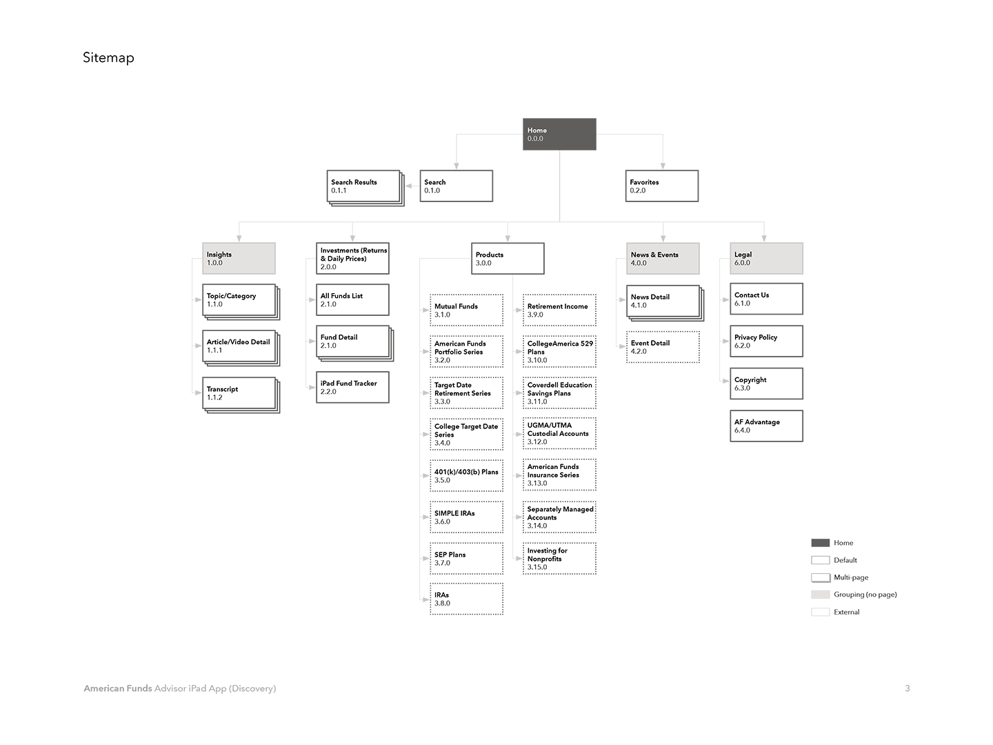
Information Architecture
Working with the UX Designer, we optimized the site structure as there would be a content fork from the website. We also did a slight rethinking of the taxonomy to move pages and buckets around, while ensuring consistency of nomenclature with the website.
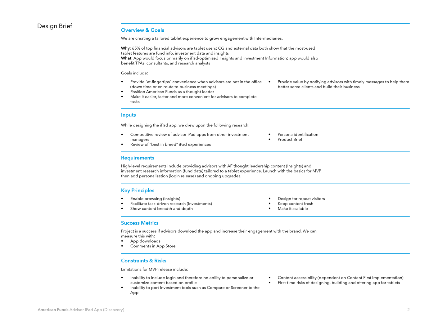
Design Brief
I wrote this design brief to ensure we had a manifesto we could always refer back to, to ensure we stayed true to our goals, requirements, guiding principles, and success metrics.
Sketches
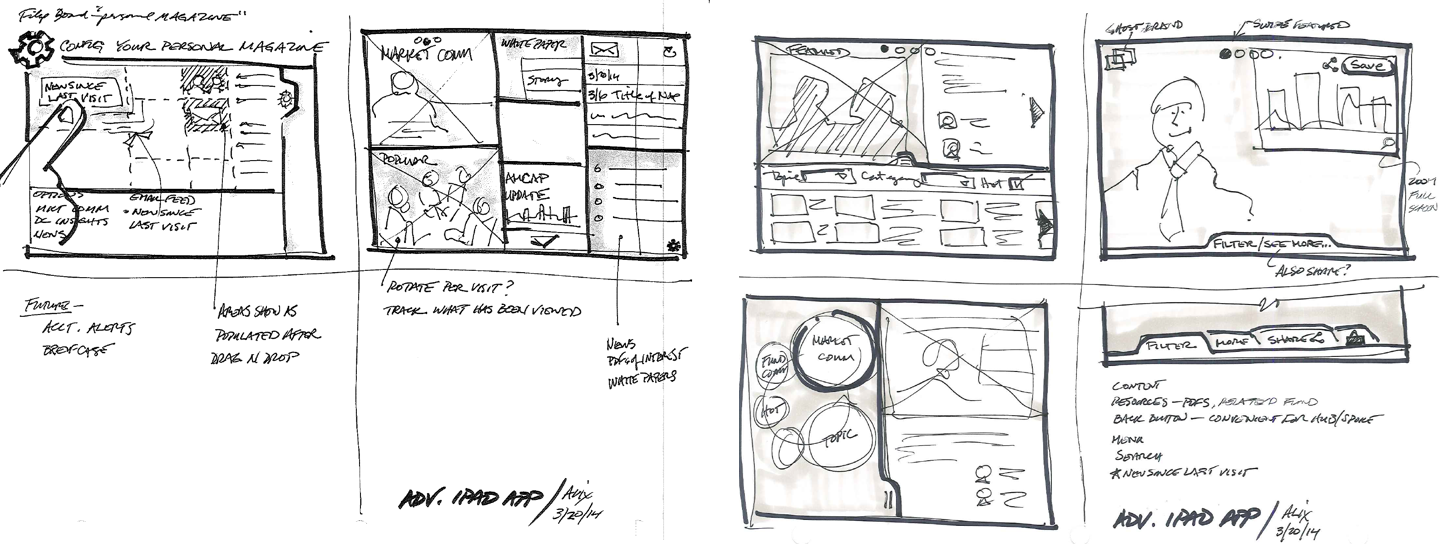
I wanted to make sure we were always thinking visually through sketching, which helps facilitate discussion and ensure we were all on the same page about concepts. It's also extremely efficient to create and iterate on. In fact, we often went straight from sketching to prototyping. It was also a democratic process, as everyone, including non-designers, were encouraged to sketch their ideas.
Shown below are some of the fantastic sketches of our UX Designer.
Wireframes
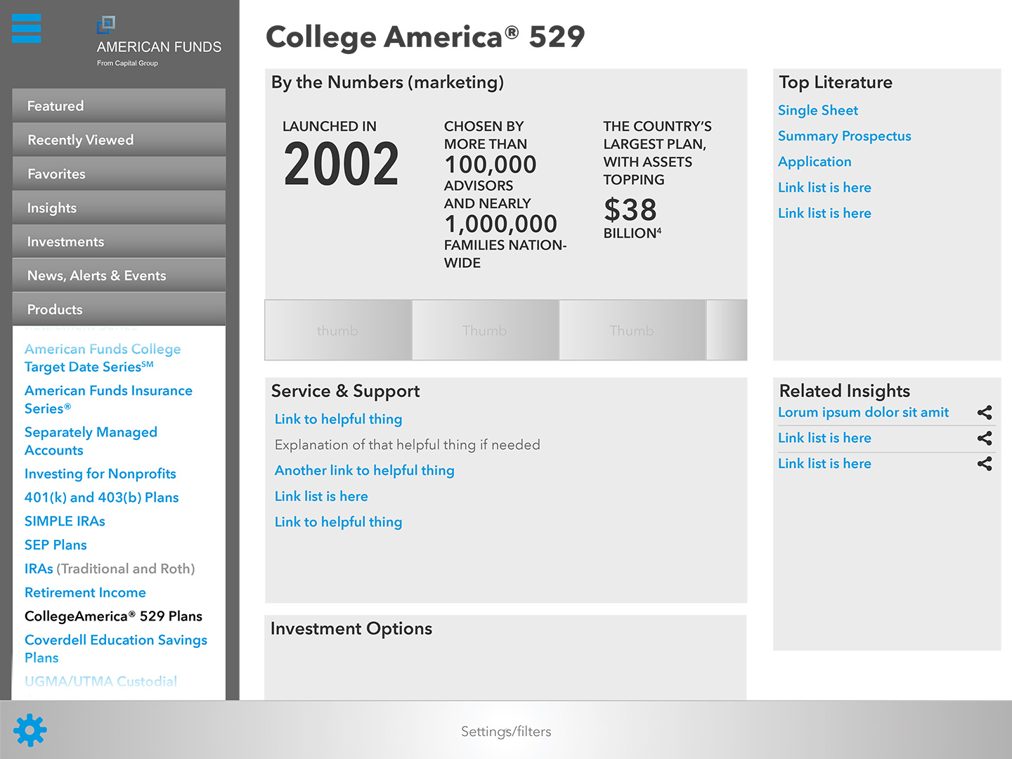
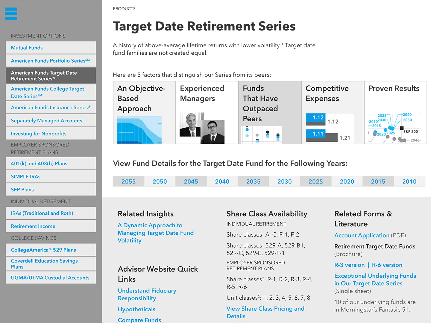
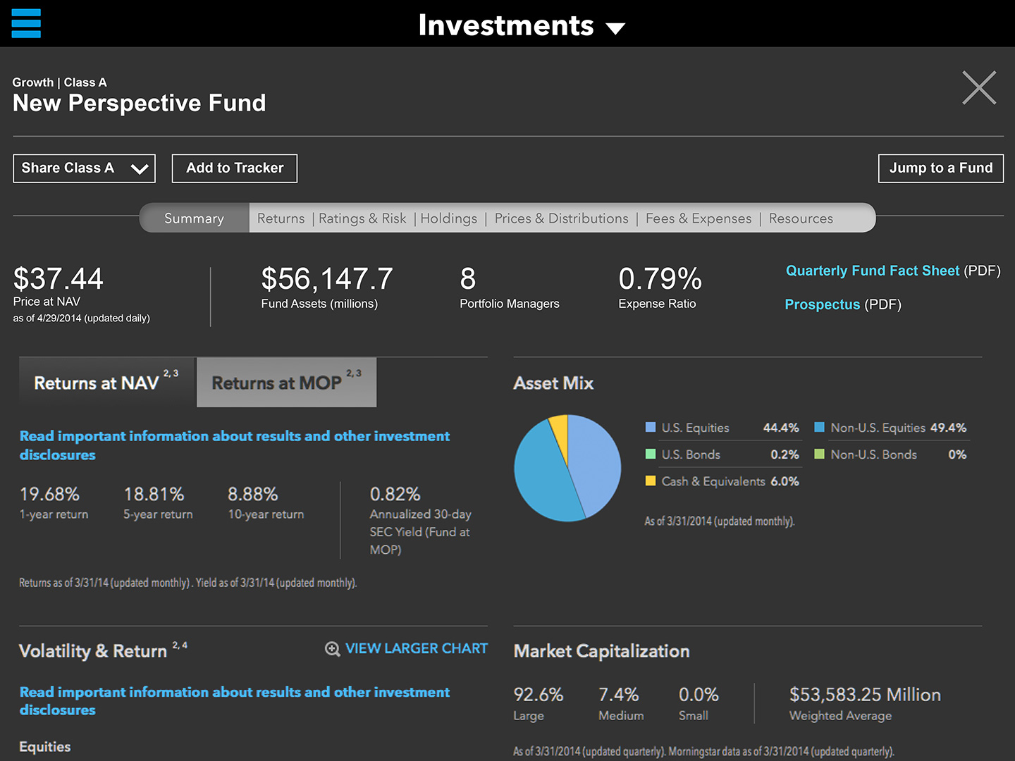
Our UX Designer created these wireframes which helped to inform the prototype. Because we were working lean with a lower priority on artifacts, we only gave these wireframes as much fidelity as was needed for the team. This reduced the amount of time that would have been spent cleaning and documenting them in order to present to stakeholders.
Prototype
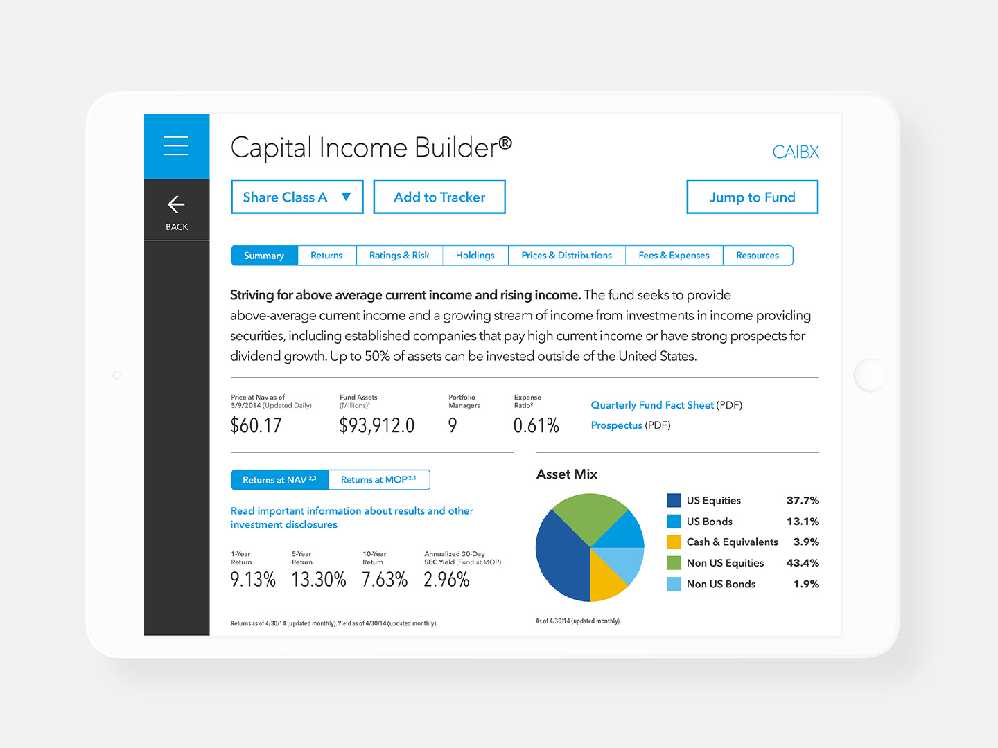
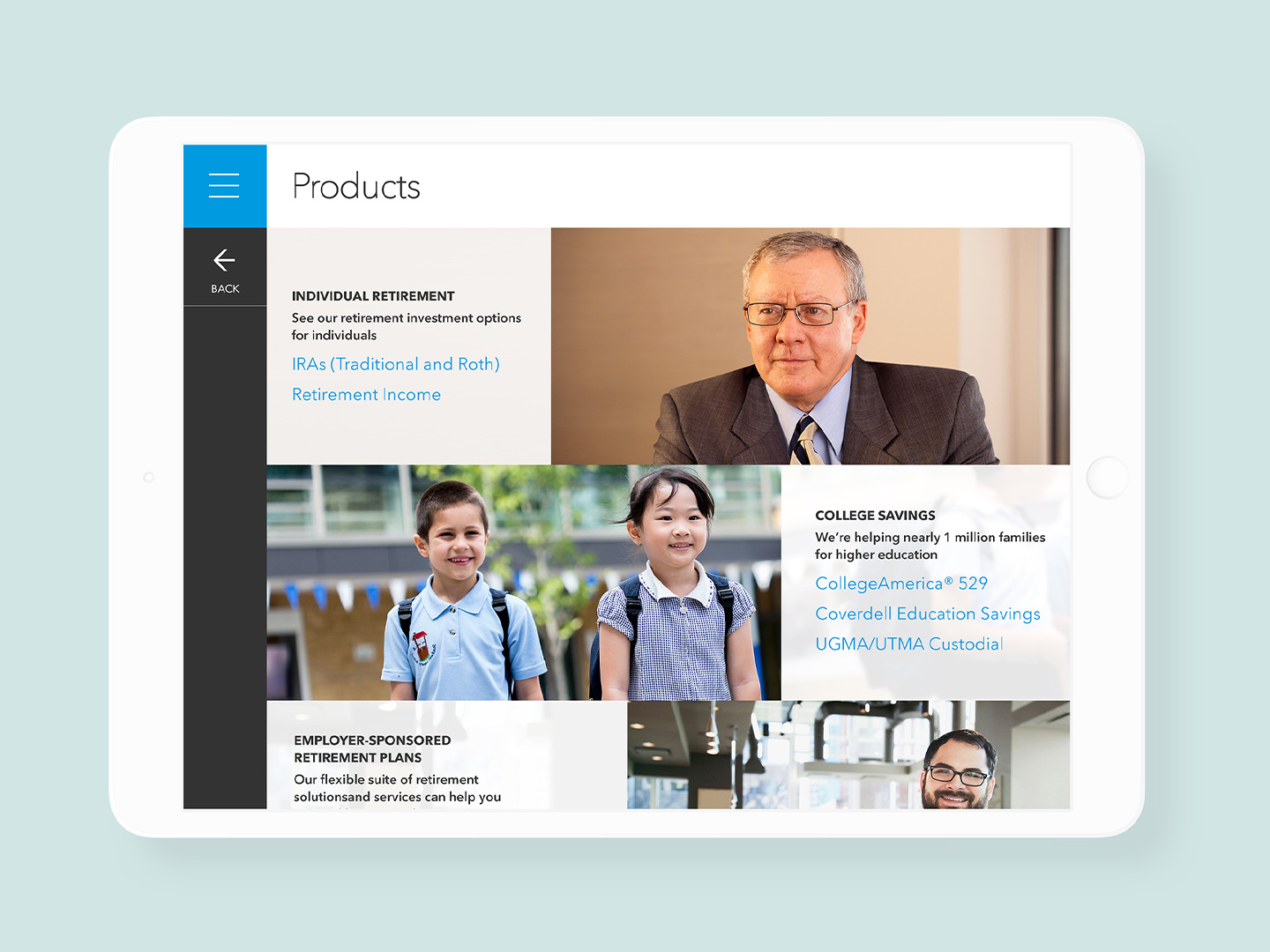
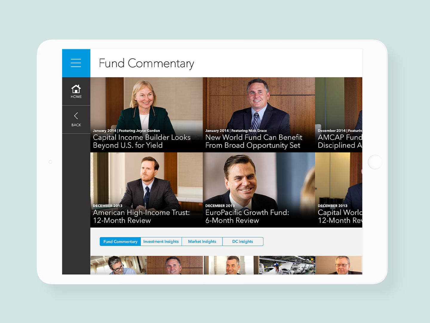
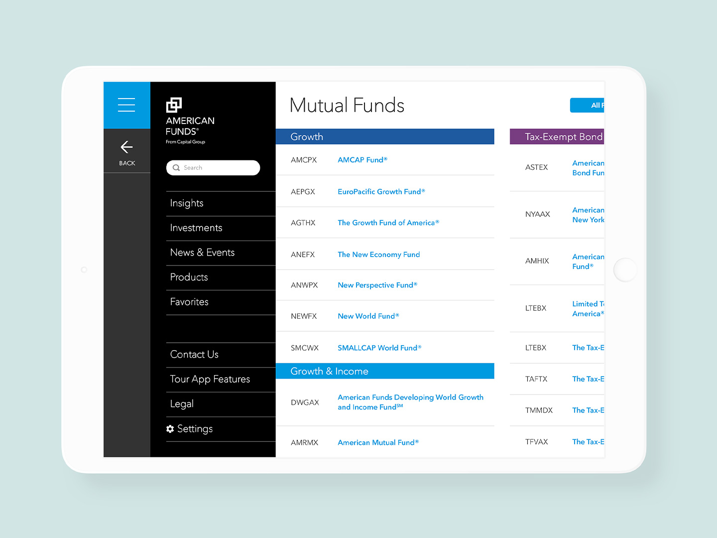
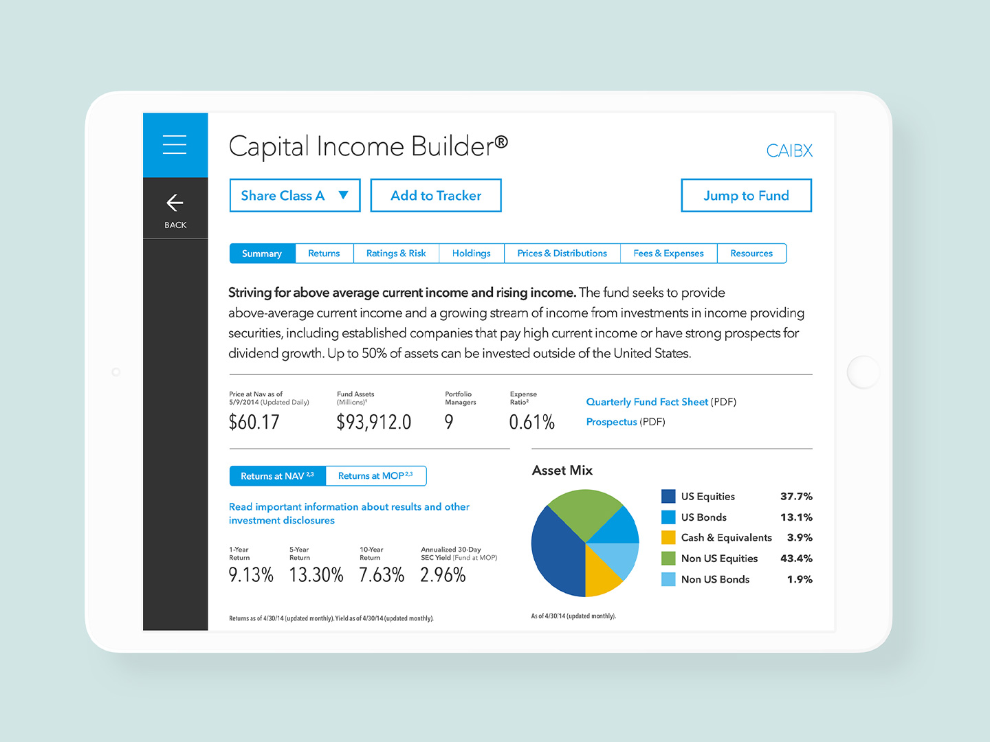
I knew from the beginning that the best way to set up my team for success was to have all of our work culminate in a prototype. The advantage of a prototype was that it was visual and tangible (much more than a Powerpoint would have been), and the best way to make our concepts and recommendations come alive for our stakeholders.
I created the prototype in Axure, with the designs from my UI and UX Designer.
Outcomes
The work itself was very well received. The prototype made the difference, helping to really engage our stakeholders and get them excited by the possibilities of the concept.
While it didn't directly result in further work as an actualized product, it did help set the tone and foundation for the company's mobile strategy until the company became more comfortable with the approach.
