Apples & Oranges
Making comparisons easy in fixed income

While equities are where most people are focused, the world of fixed income is a very large opportunity. And it had just gone through a monumental shift. Morningstar, one of the premier resources for financial research, had just split the largest category of bond funds into two. That came out looking rosy for us. But we had an awareness problem.
Client: Capital Group
Roles: Art Direction, UX Design, Visual Design, Illustration
Challenge
Because the change was very topical and recent, we had to quickly take advantage. Normal engagements with our agency of record for marketing campaigns would have taken months to ramp up, and months more to execute. We only had a couple of months to get this into the wild.
Approach
I convinced marketing leadership that we had the in-house talent to be able to execute this on time and way under budget. We quickly scrambled together a team and ideated on several concepts.


Concept sketches
We landed on the concept of "Apples & Oranges" as a familiar idiom that could be executed visually. I sketched some illustrations on my iPad to help art direct and visualize the concept.
Photoshoot
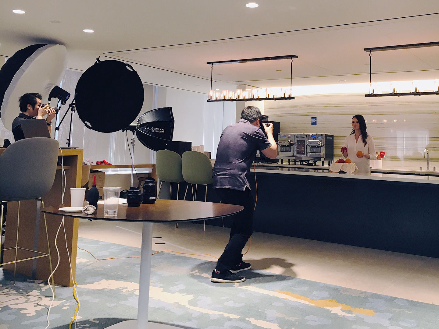
We recruited one of our designers, a talented photographer, to do the photoshoot, while I art directed. The location was a work kitchen (I provided the backdrop props). All models were work associates.


Journeys & Acquisition Funnels

When thinking through the user journeys, I thought it through the lens of an anquisition funnel. Prior research told us a few things. One, that advisors were not aware of the Morningstar change, and two, that they were not aware of Capital Group | American Funds being a fixed income shop. So that was the job of the planned digital and print ad campaigns, which would then direct advisors to the website.
Once they've visited the site, we now hope they are aware, but more importantly, within the consideration phase of the funnel. It then becomes the job of the website to help inform them of our offerings and arm them with the knowledge they need.
Once armed with this knowledge, then starts the crucial decision making phase. I knew we needed to capture their attention on the website with something that they could engage with, and thus we created a quick tool to provide lots of value without much effort, in order to help them make a better decision.
Personas & A/B testing
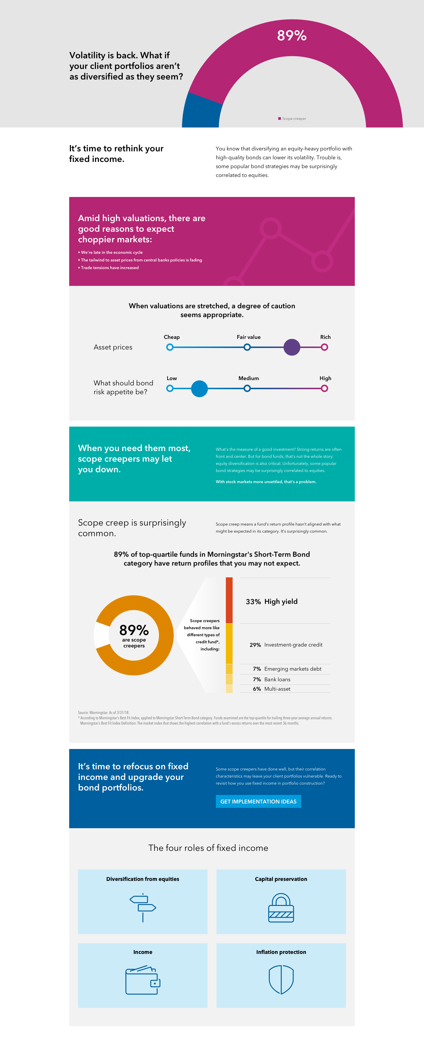
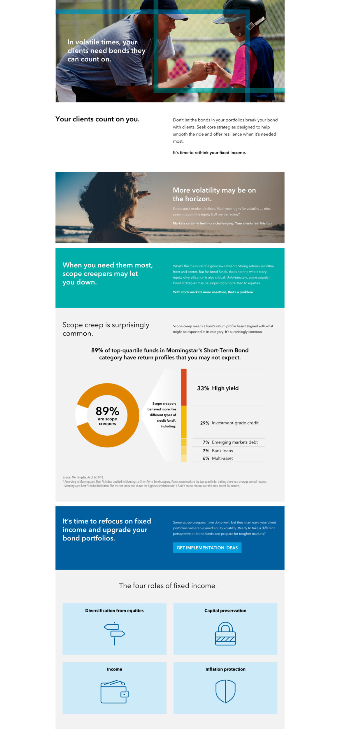
Based from our prior research we knew advisors generally fall into two categories: Sage & Caretaker. The Sage enjoys the power of knowledge to provide the best outcomes for their clients. The Caretaker places great emphasis on taking care of their client's needs. Advisors often are a blend of the two to differing degrees. We prepared two versions of the site landing page for A/B testing. One indexed more heavily on data-driven proof points to satisfy the validation needs of the Sage persona, while the other focused more on the emotional aspects.
Option A: Sage persona
Option B: Caretaker persona
Fund Analyzer Tool
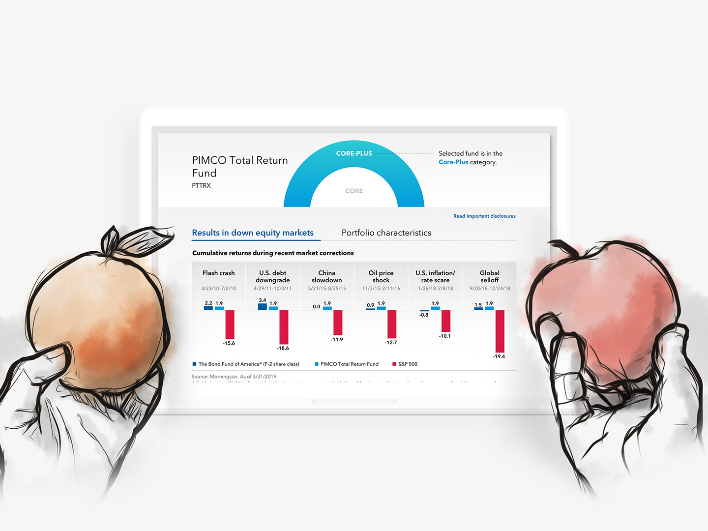
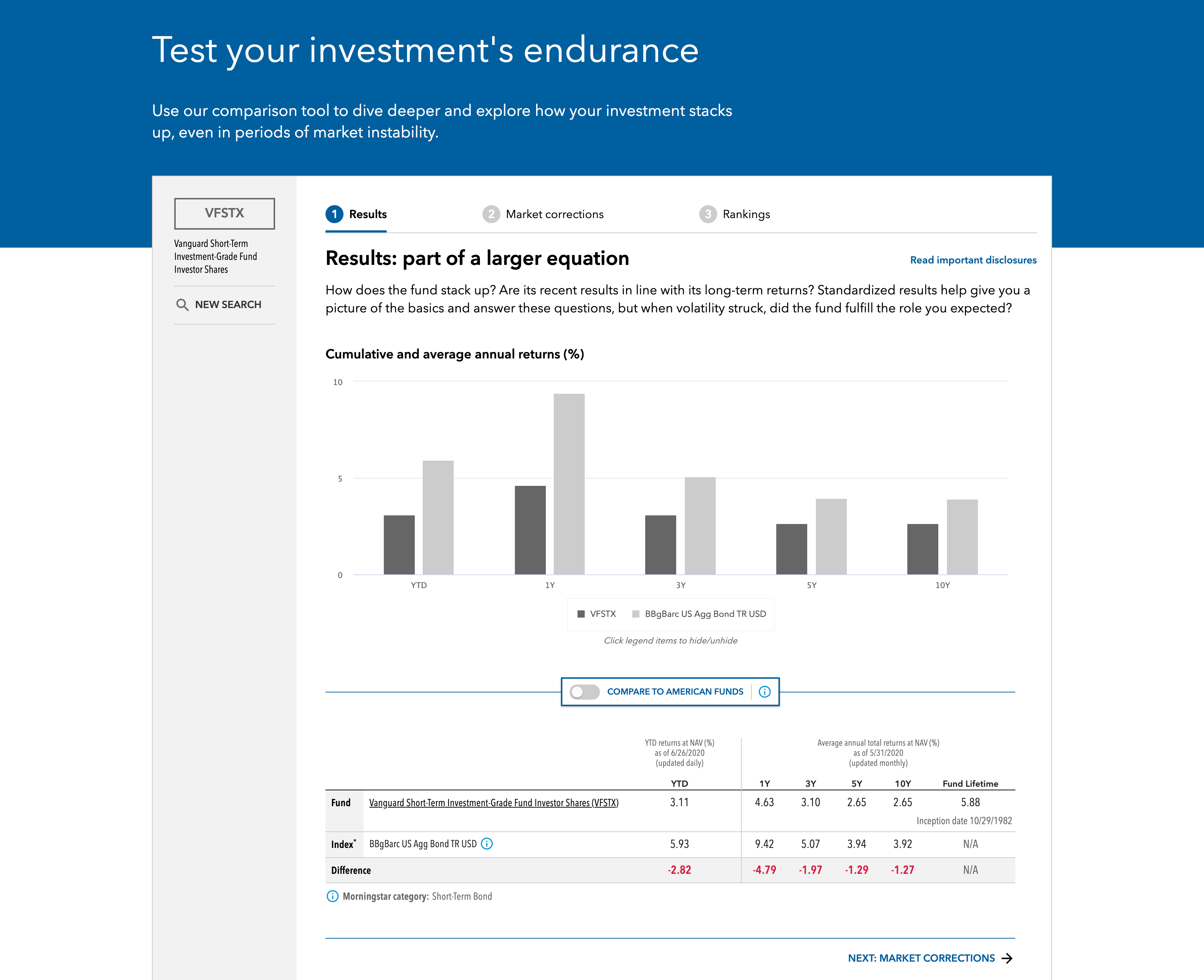
The website tends to be full of marketing speak, and so to offset that, I wanted to engage their Sage side by providing an easy and quick tool to assess what category their fund fell into, and how it fared against our offerings. We wanted to do this with the last amount of friction as possible, so it only required one input (the fund name).
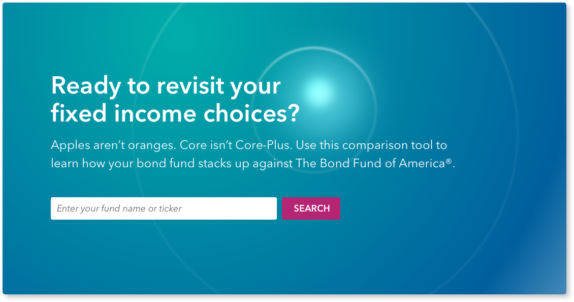
Output
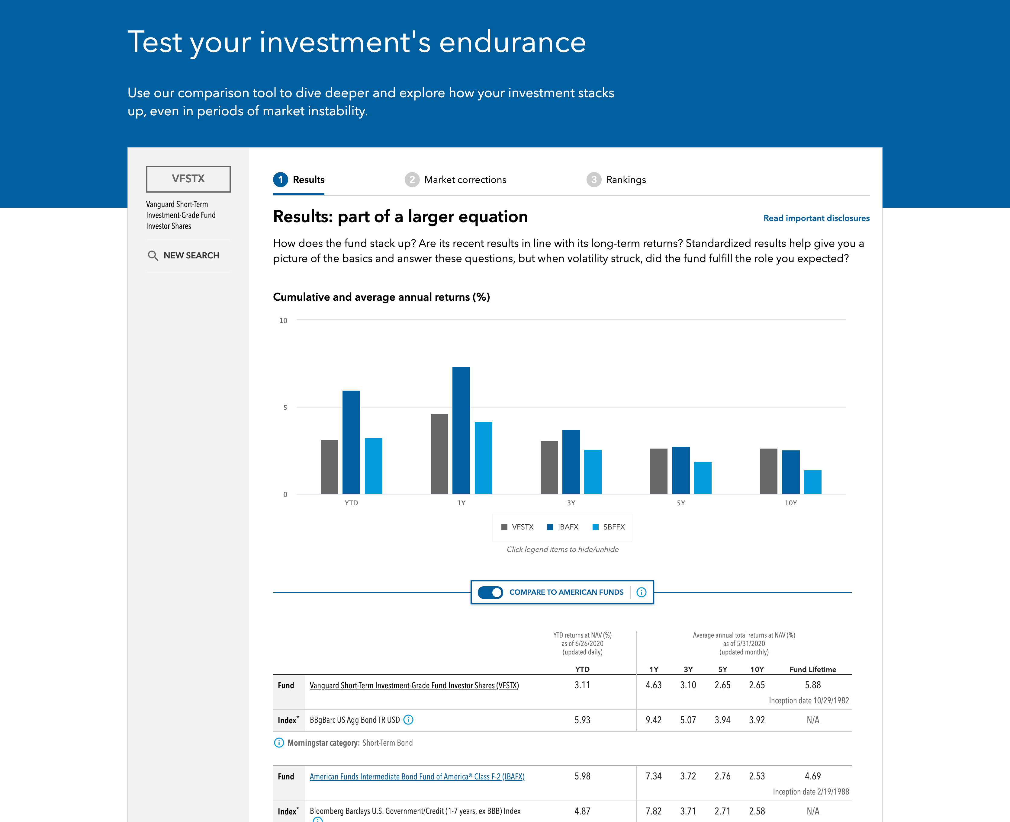
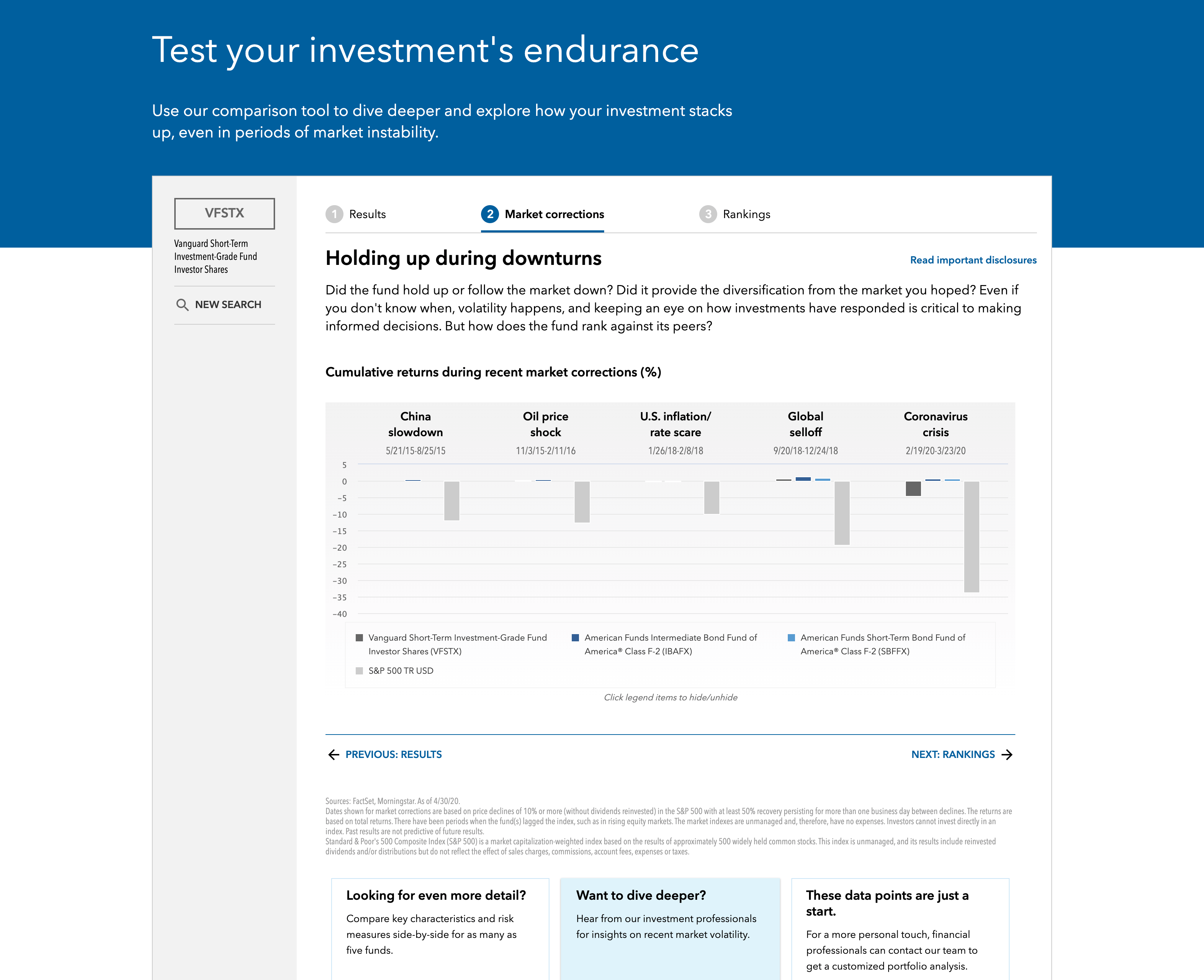
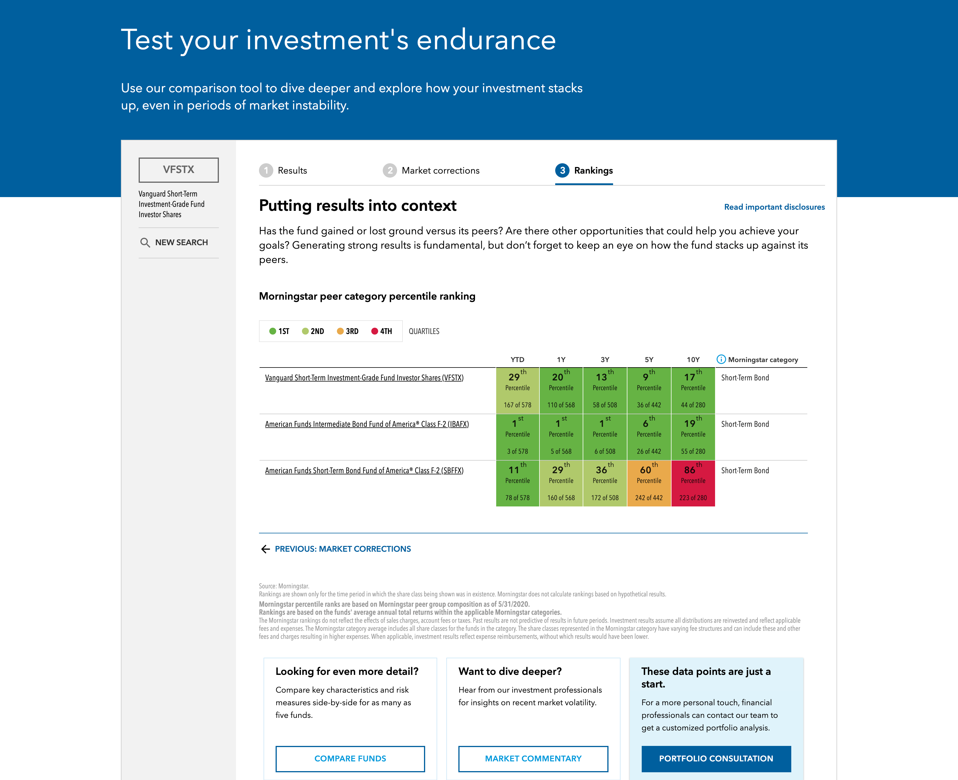
The output, presented as clean, simple data visualization, provided unbiased comparisons between the fund they inputted and one of our premiere bond fund offerings. This included performance/returns comparisons, which advisors are used to, but also compared them on metrics that American Funds usually perform strong on, which is reduced volatiility, and better downside protection (one of the reasons why you might hold a core bond fund in your portfolio).
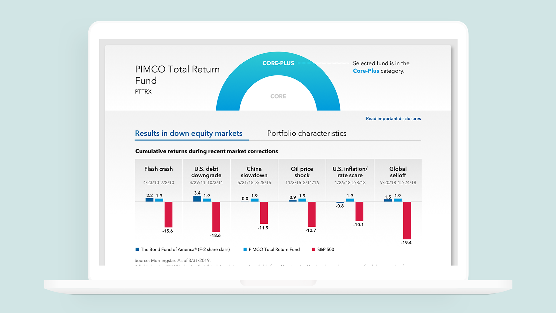
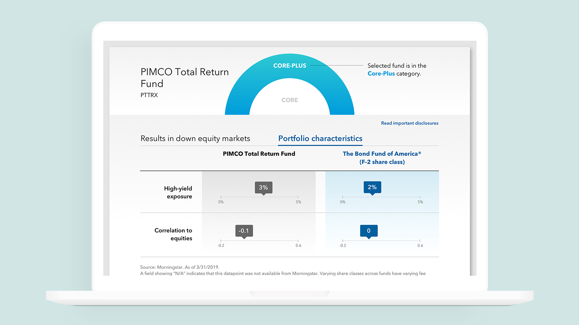
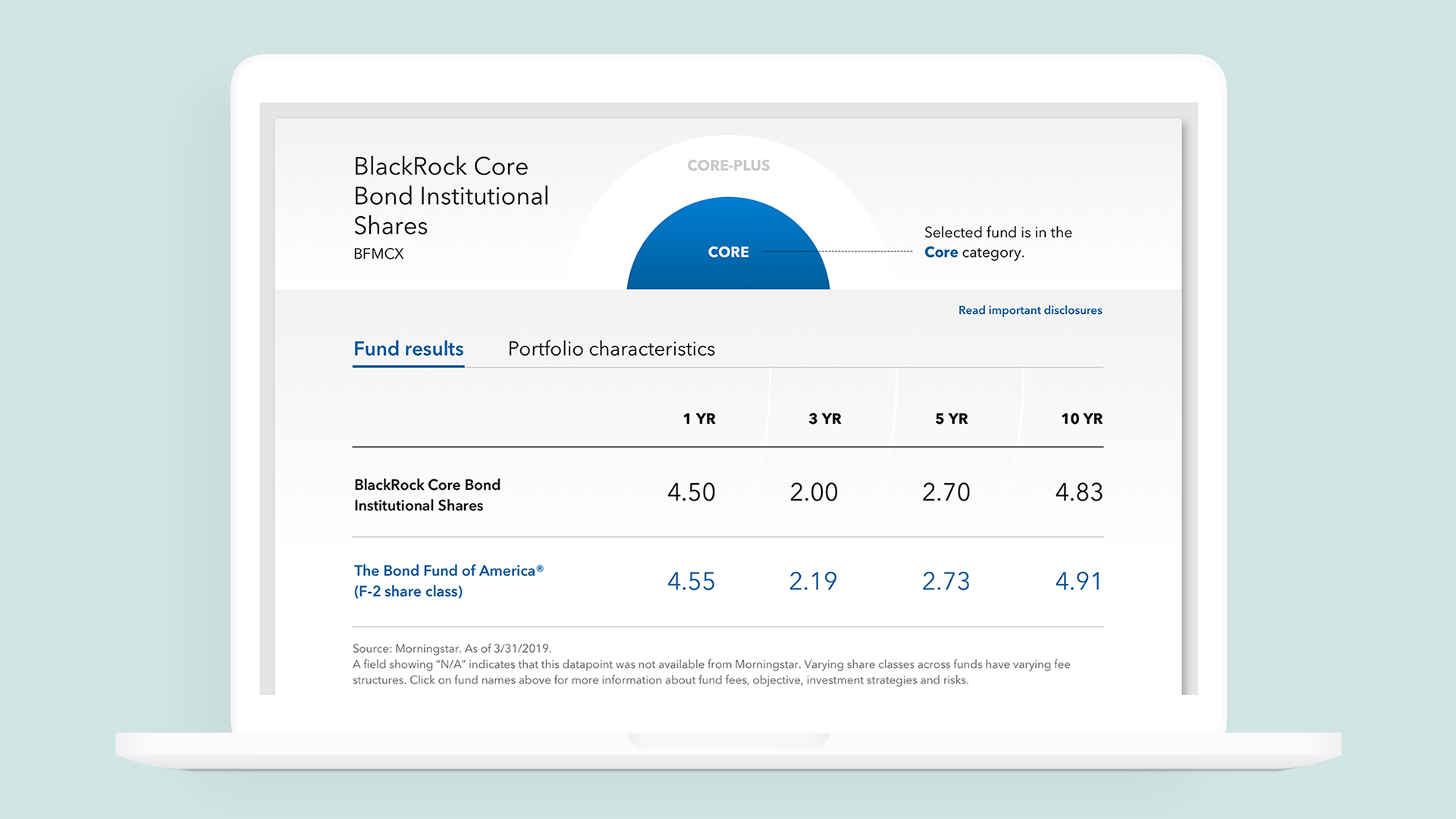
Evolution: Volatility widget
The tool was so successful that is adapted into a tool featured on our volatility hub, which aimed to give advisors talking points to assuage their clients during periods of market volatility. The tool was recontextualized to include all funds and added some new features, including a Morningstar ratings comparison.
Print ads
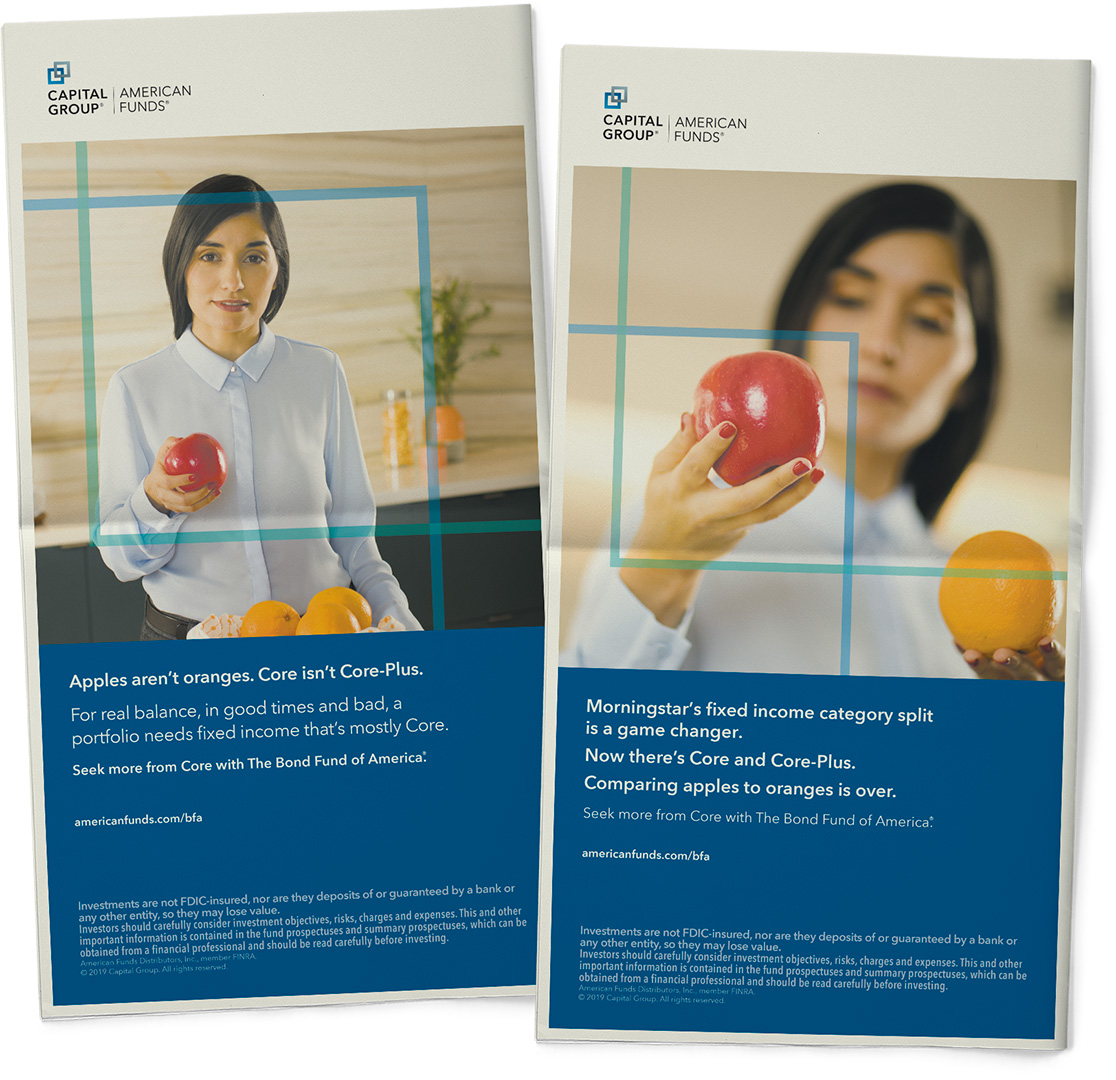
We took full back page ads in the print versions of The Wall Street Journal and Barron's, with links to our website. I designed and created the mechanicals.
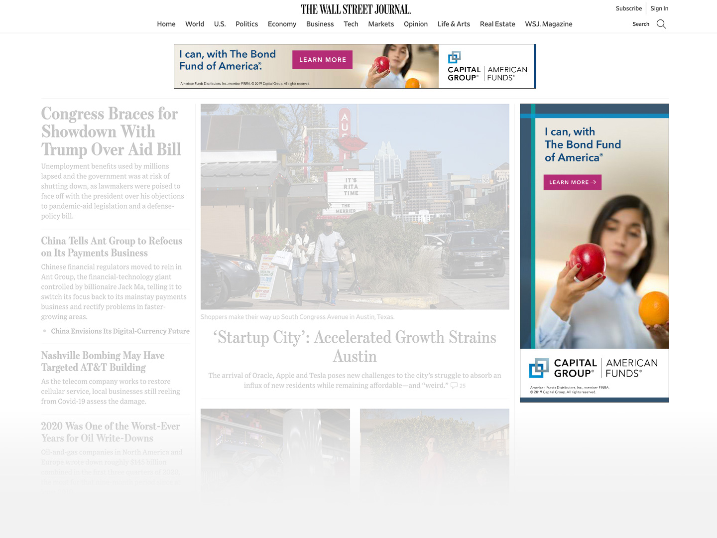
Digital ads
Digital ads were placed in various highy trafficked websites. I designed, animated, and coded the ads using Adobe Animate.
Result
The campaign was an overwhelming success. The tool ended up being one of our most used on the site after just a short amount of time. It was so successful that we continued to run the ads beyond the planned timeframe.
2x
Engagement metrics
as compared to baseline metrics on prior campaigns
3x
Faster to market
than working with our traditional ad agency vendors
1/25
The budget
of a traditional digital ad campaign
