Project Titan
A better fund finder
Capital Group had many award winning funds and strategies, but it was difficult to understand all the options. The current site required several clicks to get information, and the information was dense and hard to sort through. Furthermore, it was difficult to compare the funds and understand the differences between them.
I worked with a small team to concept an app that would aim to solve these pain pints and simplify the user experience. Furthermore, it was built with tablet devices in mind, as many advisors used them in the field.
Client: Capital Group
Roles: UX Strategy, UX Design, Visual Design, Prototyping
Designs
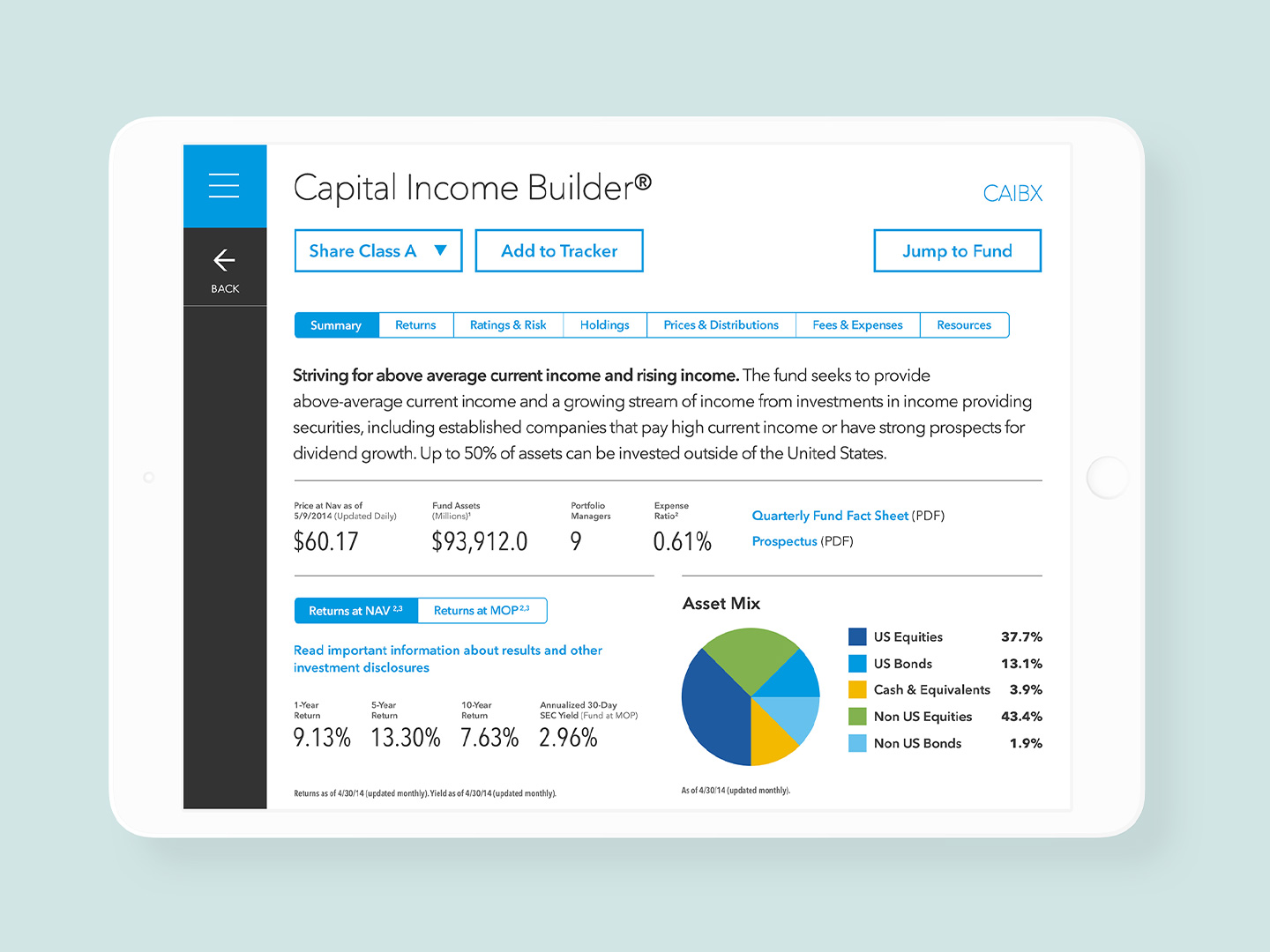
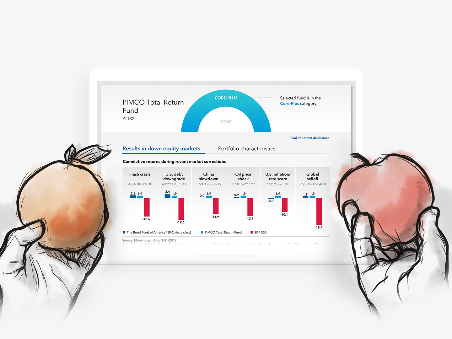
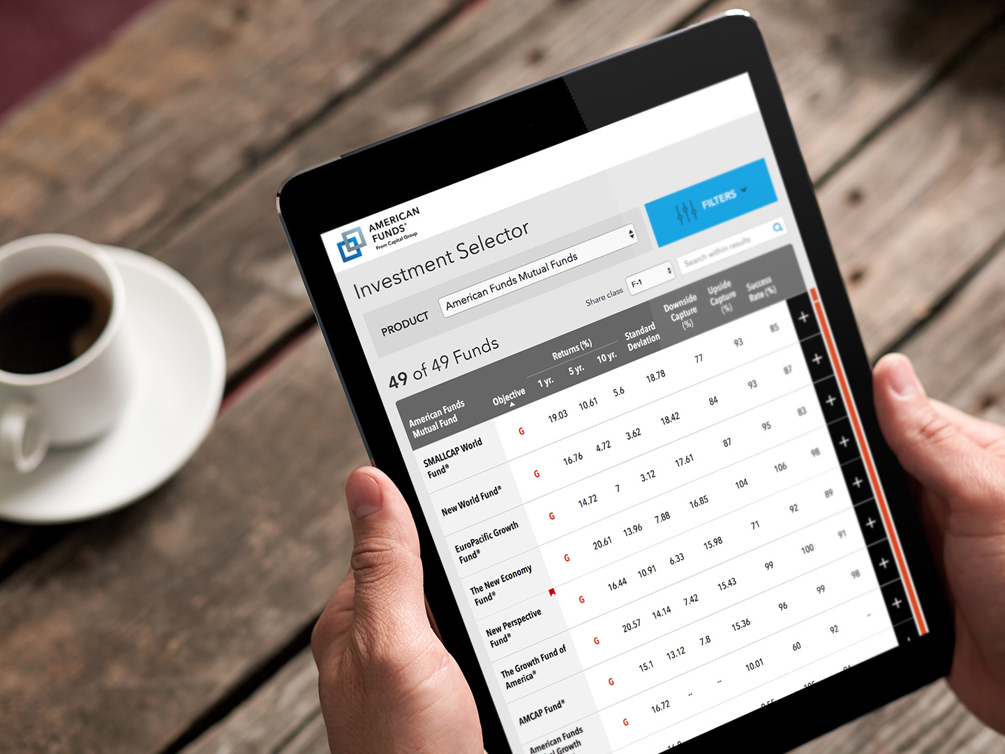
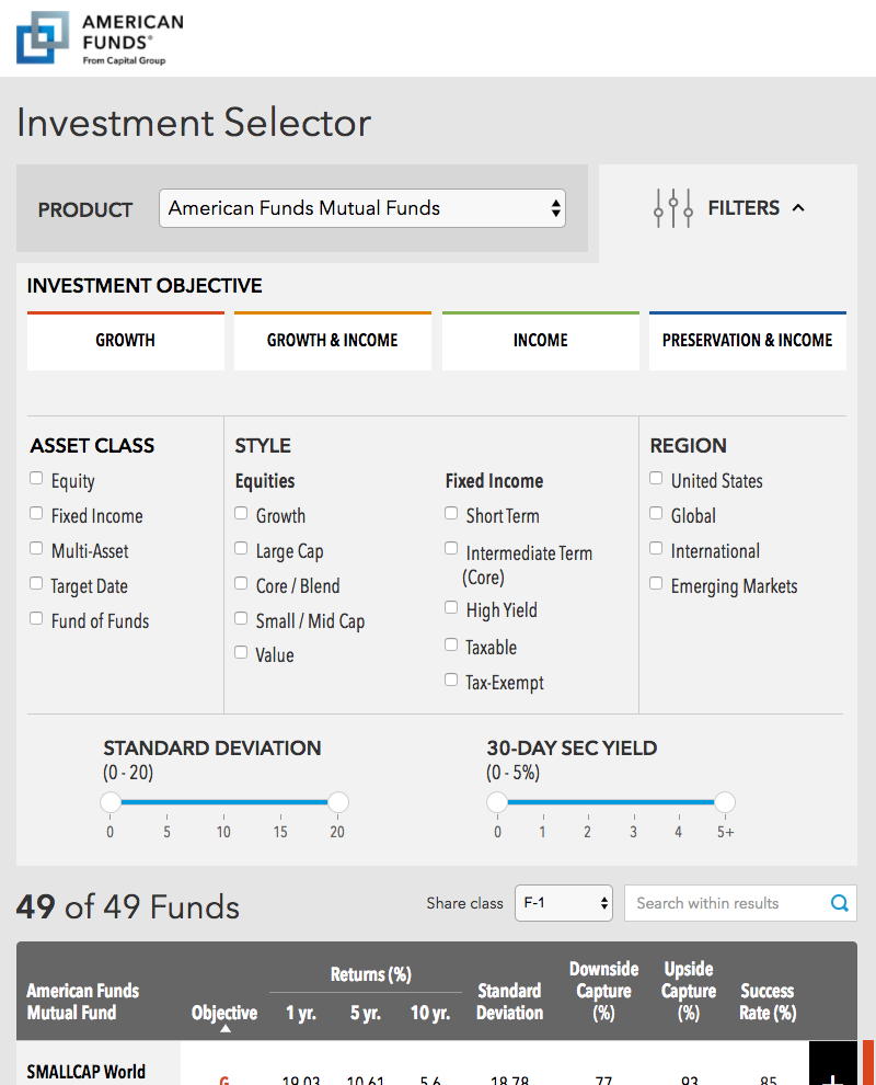
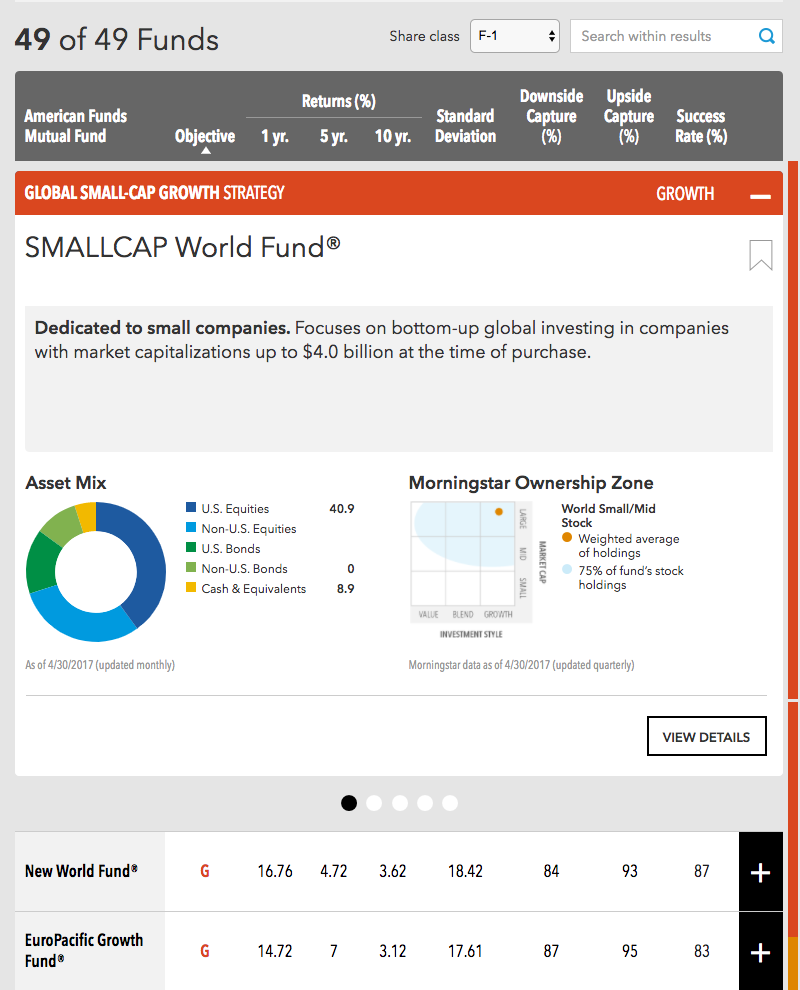
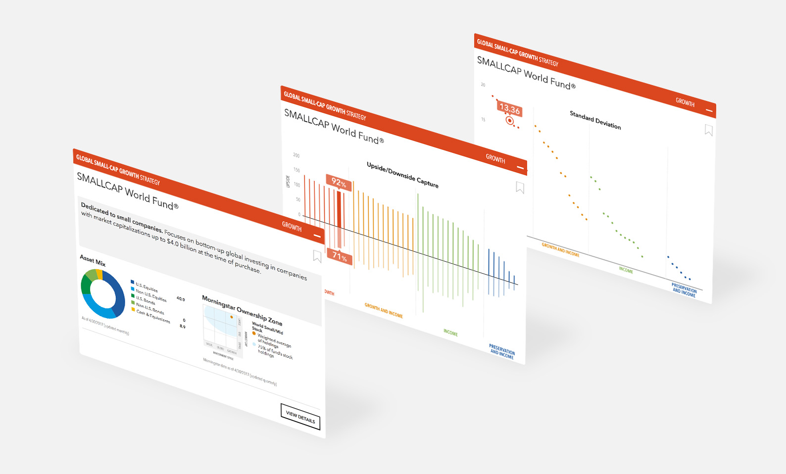
The following screens show the simplified interface, starting with a filter panel to narrow down fund choices. The generated list of results bubbles up the most important standard data points at a glance, and deep dives can be quickly accessed through a card-based paradigm showing different aspects of the fund or strategy.
Results list with tabular data
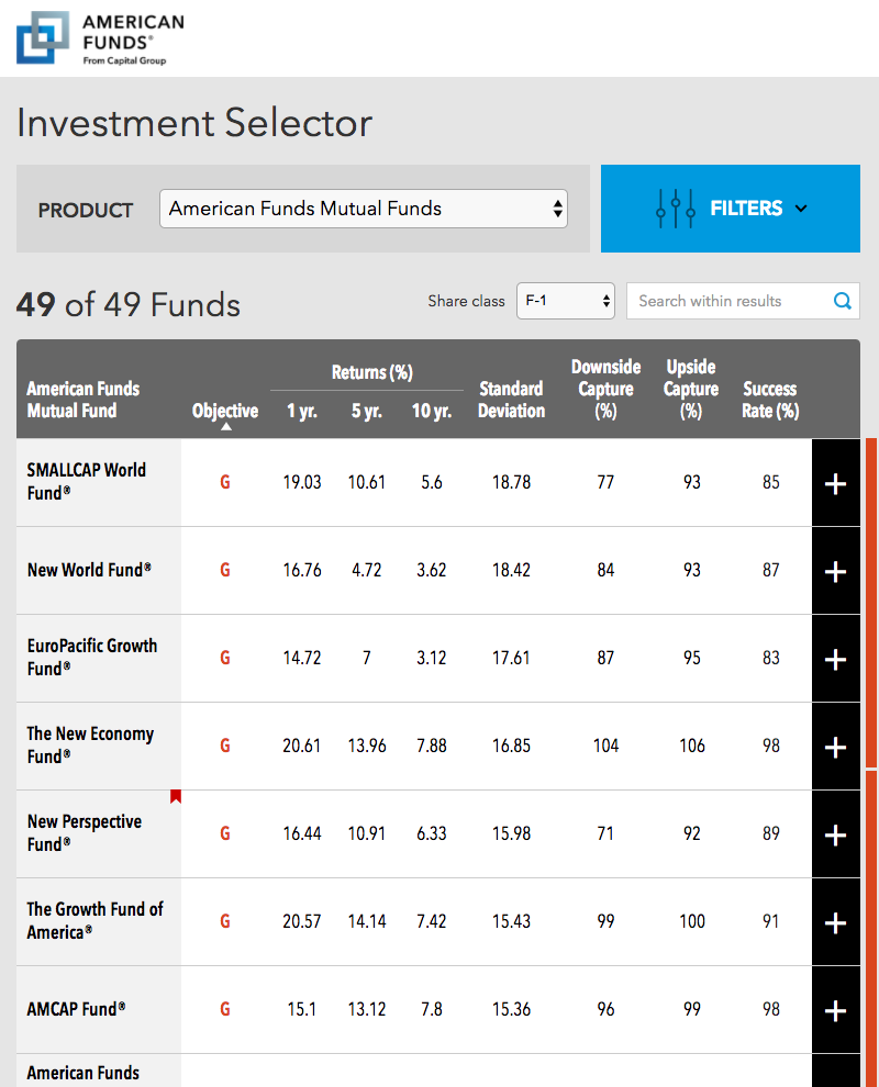
Filters
Info cards
Prototype
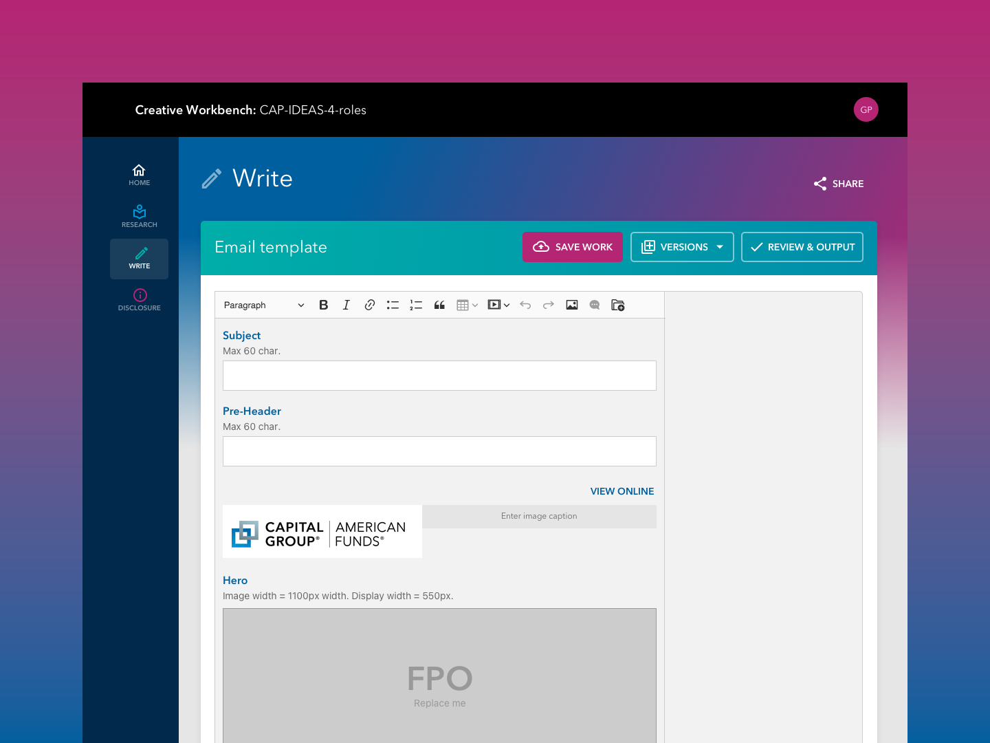
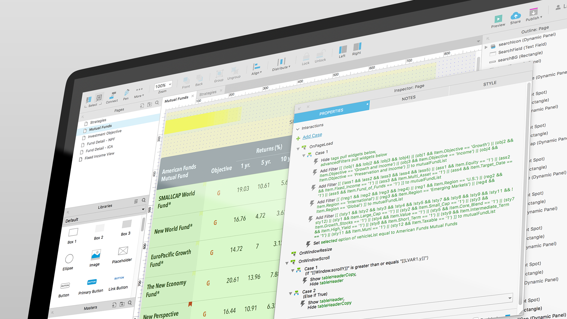
To ensure that stakeholders understood the power of the concept, I built the prototype in Axure. Axure allowed me to build it using real data for all the funds, and real filters and search capabilities, so that the prototytpe felt as dynamic as the actual product.
Click the video below to view the prototype in action.
Outcomes
This prototype was very successful in allowing stakeholders to not only understand the concept but also sell it to leadership. While it did not result in anything beyond a concept due to budget concerns, it provided a vision for us to aspire to.